As the final days of my senior year go by, I find myself feeling nostalgic of all that happened this year. It literally flew by before I even noticed. This is the last ever update of my work that I will make on here, and it includes everything which I worked on this year, and a few pieces from the previous year. It's literally a collection of not only my work, but also my memories of this year, and as cheesy as it sounds, I will miss it all. So here it is, my overall 2D Design portfolio compressed in a short YouTube video.
|
I have been putting off making art pieces for a while now. My problems with procrastination is affecting the way I have been viewing art, and has got me thinking about whether or not I can really do it. By that I mean that we have an incredible amount of talented students in our class. All of them experimenting, and progressing so much I feel like I’ve completely fallen behind. A horrible part of me is also jealous of the art they can produce and makes me feel like I can't do what they do. I know I shouldn't be thinking that, but sometimes I can't help it. I have fallen behind. The obsession I have with making a piece perfect, and the way I want it look like in my head has got me throwing away the ones that don’t project what I had in mind. I read the Top 10 Mistakes By An Art Student, article, and just like many, I found myself relating to many of the steps written in it. Particularly the Procrastination step. It is common sense that you can’t produce great art by working on it last minute. Time is needed, it unfortunately can’t just pop from your head and land on paper. Art is difficult, needs effort, and dedication.
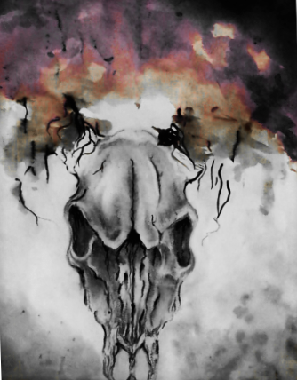
Last week, I had a project in English where I had to draw a picture of a symbolic point or aspect from a book I read. It had been a while since I drew anything before that. As soon as my pencil made contact with the paper, I found myself at the calm state of mind which I forgot I always get when I draw. Just me, my music, and the canvas. There is just something amazingly soothing to just being in your own little state of creativity, not minding anything else around you, and blocking everything but your concentration on each pencil or brush stroke. I am not going to say that I have many ideas after not working for so long, because unfortunately I don't. I only have a few. This time however, I will not make unrealistic goals for myself. But the moment of remembrance I had of the amazing feeling I get has inspired me once again to continue. 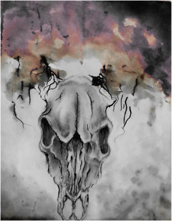 When I first heard we were doing boundary, I immediately thought I wanted to make a piece showing the boundary between life and death. The problem was how to illustrate that. I was envisioning the skull of a ram, with half of it being an actual live ram with it’s muscles, skin, and fur still intact, but I didn’t feel very confident drawing the fur so I opted for the entire thing to be a skull. I’ve always been intrigued with the white and the the placement of shadows on skulls and thought it would look really amazing drawn on charcoal paper with black and white charcoal, but I had already done that so I decided against it. I wanted to try something new. Thankfully we were already practicing watercolor so I wanted to incorporate that in there. I was wondering how I wanted to show the life aspect of the piece, for death is already clearly the skull. I decided to do the skull completely grey to show the dull and not so colorful part of death, and I made color fade out of the horns. As the color moves further and further away towards the other end with more color, gets more vivid. The boundary between them is the grey transitioning to color.
For this project, I researched pictures of ram skulls for reference because I don’t draw many skulls, so I used by global resources. I also learned new things as I strayed away from graphite and experimented with watercolor. I was an interesting experience, very uncontrollable unlike the graphite which is usually precise. And I really wanted to communicate through my art and I think I succeeded in doing that. I just wished my watercolor looked a little better, but it was my second time working with it so I’m not too upset. The only thing that upsets it how crooked it is. Overall I’m happy with the piece.
In life, there is a minimal amount of choices we have control over. Like what kind of people we are, who we befriend, how we will live our lives and more. But there are aspects in which choice is not an option, and where you come from is one of them, Unfortunately we can’t decide what kind of family we are born into, or where we live when we are little. All we can do is take all of that, and “bloom where we are planted.” This quote to me means that you can take all of the negatives and positives and transform them into ways in which you can improve, and continue developing as a person. Instead of constantly wishing you had something you don’t, discover your own talents and passions and create a goal for yourself. You could be born with a particular talent, but without all the hard work of practice, that talent will never truly bloom.
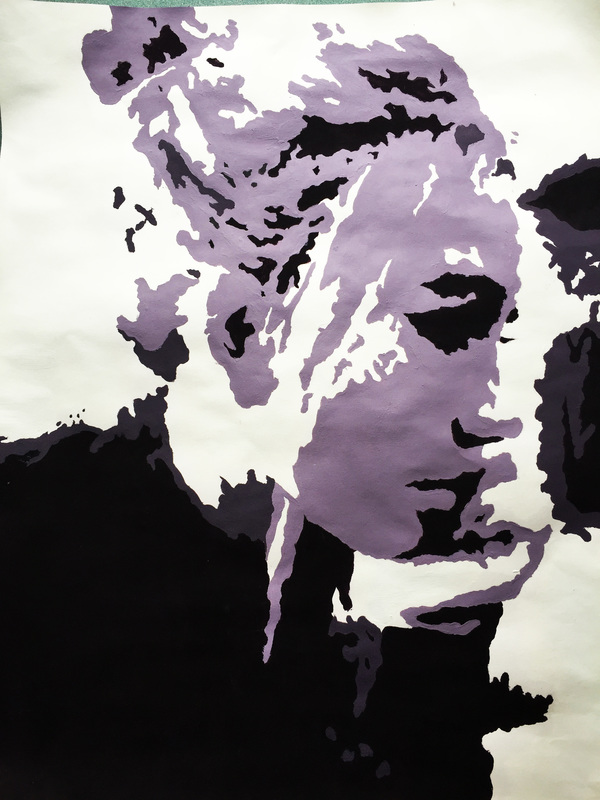
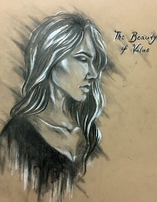
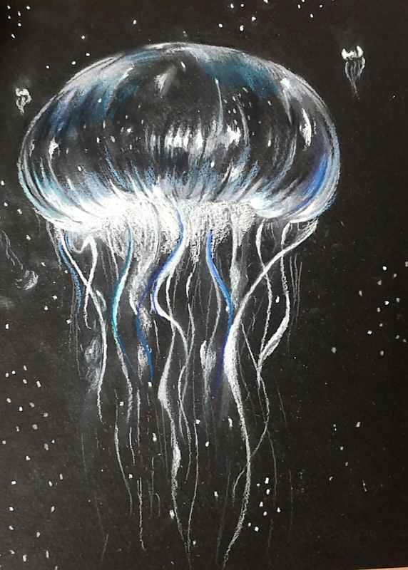
The quote that inspired me, and has inspired me for a really long time now is by one of my favorite artists called Landon and it reads, “You are not damned by others judgement.” I’ve used this quote before for my summer work, but I decided to use it again because it’s such a simple yet strong quote to me. Being able to diminish the judgement holding you back from any kind of situation is such a relieving feeling. Being able to say “I don’t care about all of this” is just great. For this project, I decided to try something new and took a risk with working on a black canvas instead of a white one. I’ve always really liked the inverted images of the highlight being accentuated more than the shadows, so I tried to mimic that. I decided to draw a giant jellyfish surrounded by many tiny ones. I drew it in correlation to the quote, because when I was little, I was at the beach when I realized that you really aren’t damned to other people’s judgements, and so the beach holds a small special place in my heart for that. I used a reference picture from Pinterest in order to draw the jellyfish for I’ve never drawn one before. I tried new things by trying to incorporate some color into it too, but I feel like I ruined it by adding it at the last minute. Overall I’m satisfied with how it came out, but I wish I made it look a little better.  Value is the relative lightness or darkness of a surface. Artists often use this in order to create an illusion of three-dimension on a two-dimensional canvas. The difficulty of this technique often lies in wielding control of the tools used to recreate depth and highlight in a way so that when your eyes travel, it is not perceived as simply flat. For example, when trying to show value in a piece with graphite, a slow graduation from light to dark is key otherwise it would result in a sloppy outcome; unless that is the intended goal of course. Being conscious of highlight and lowlight placement, making sure everything is blended seamlessly without any harsh lines is a hard technique to master. But with more practice, the better your piece turns out. Starting this project, my list of twenty items that relate to value were:
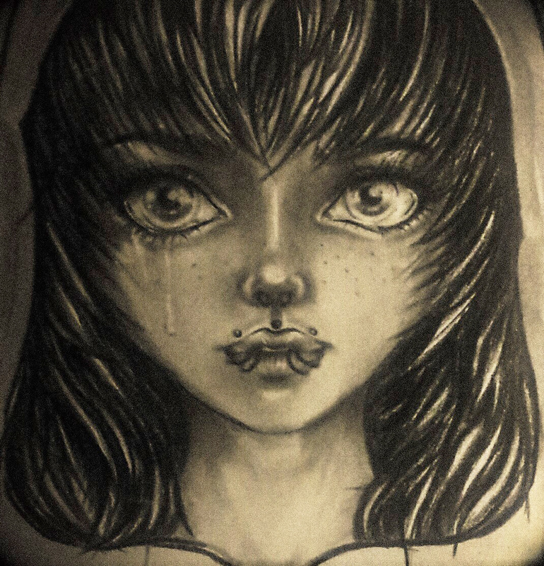
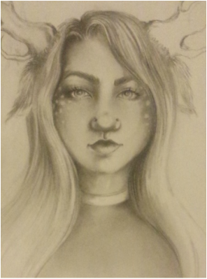
In the end I didn't make it look unfocused, but rather messy. Overall I'm happy with how it turned out and I wanted to take a risk with this by using white charcoal and a 5B pencil. I don't work with charcoal, but I figured the value would really show up on this paper. At one point it ended up really messy so to solve my problem, I erase it all and worked with the leftover lines. The majority was covered in white charcoal. The blending did not turn out the way I wanted and the messy background doesn't really match the focused face and hair.
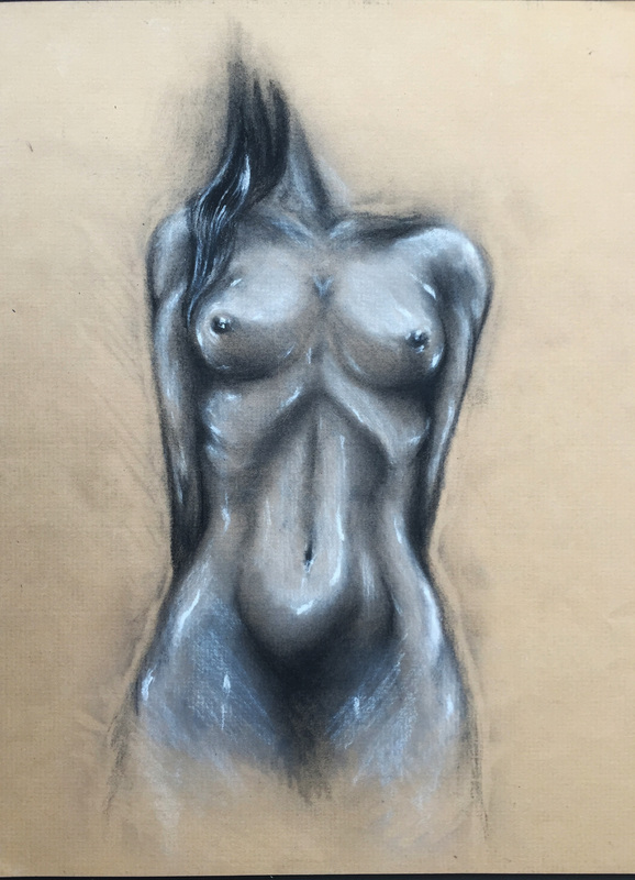
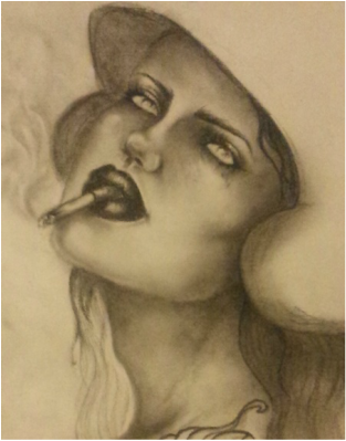
Dear Ms. Haggerty This class and I have had our lovely moments together. I have enjoyed every minute of finally being able to get out of my comfort zone and try new things. Never before have I been willing to let go of this constant thought that I won’t be able to catch up to all of the other amazing people in my class. To me, this time has always been an opportunity to express myself through imagery, imagination, style, and personality. I have been very lucky to be working with mrs. Haggerty, who is always so willing to help and understand us as well as give us time and freedom to do what we need to do. To be truly honest, I have never thought of myself as someone worthy enough to be called an artist. I knew that just that word is a very vague term, for an artist can be anything and anyone, but to me it never sounded fitting. After this class, I feel more confident in what I’ve been doing, and I want to continue exploring new methods of self-expression. Getting an A was only a bonus to me. The experience I’ve had matters much more to me than the single letter of accomplishment I received in the end. 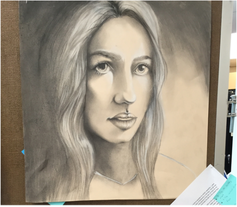 For my charcoal portrait I used multiple different tools to express my artistic capability. I used 2B, 4B, and 6B charcoal pencils to accentuate the illusion of dimension in the face. The 2B was used for the more hard lines around and in the eyes and the texture of the hair, for they do not blend as easily, the 4B for around the nose and the chin, and finally the 6B for the overall face and hair shading.
I learned how important the white charcoal is for adding highlight on the areas I wanted to make stand out, otherwise it looked really flat. A tool that also really aided me was the kneaded eraser. It helped by literally sticking the pigment off any areas where I made mistakes. I also learned how important it is not to rush adding the darker shades, and how values should not be skipped, but progressively get darker as you apply more pressure to the pencil. Making the hair was difficult, for I have never been good at drawing hair, but I took a chance and tried to focus on thinking of the hair as a whole shape rather than doing each individual strand. That helped resolve my problem to a degree, because instead of it looking very much like spaghetti hair, it ended up resembling the proper texture. I shaded the parts that were darker first, and left the spot for the highlighted pieces empty. Then I put white charcoal and blended the shaded and highlighted areas. Afterwards, I added some strands to fake the textured look. I believe I communicated through my work by trying to make it as neat as I could. Being a perfectionist, I tried to make the face look as least dirty as I could (charcoal can be really messy), and went wild on the shading in the background to add to the chiaroscuro effect. Overall I am satisfied with how it came out despite the fact that I had to cut a small part of the bottom off, because my sister stepped on it. I had never used charcoal before and I feel like doing this really gave me a chance to develop my artistic skills by getting me out of my comfort zone and forcing me to look up techniques, and try new things.
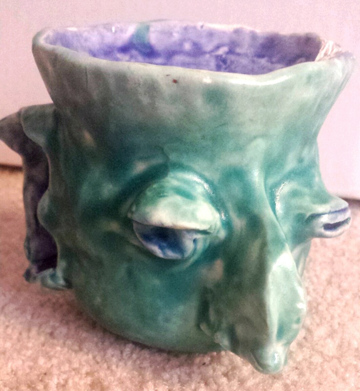
This was my little ugly mug! He ended up looking a little bit like Nigel Thornberry which wasn't even intended. This project took at least a week to complete and I am really happy with how it turned out. The paint looks a little blotchy even though I thought I coated with enough of the paint, but I really didn't. The only thing that kind of ruined it was the fact that one of its ears came off during the oven process. Other than that I love it, and I think he looks like a stud.
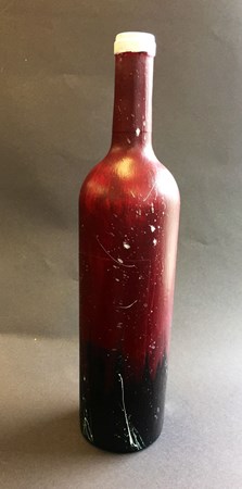 This project was really out of the norm for the class, we are usually encouraged to broaden our artistic abilities, but this one was unlike anything we've ever done before. Using bottles, we had to think of a creative way to make a design on it with acrylic painting. It was a bit of a struggle mixing the right colors every day, but in the end it turned out to be something I was really satisfied with. Our idea was encouraged to be original,as always, and it was to be a fun way to try new things.
|
Author
Archives
January 2016
Categories |
 RSS Feed
