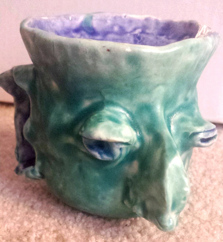
This was my little ugly mug! He ended up looking a little bit like Nigel Thornberry which wasn't even intended. This project took at least a week to complete and I am really happy with how it turned out. The paint looks a little blotchy even though I thought I coated with enough of the paint, but I really didn't. The only thing that kind of ruined it was the fact that one of its ears came off during the oven process. Other than that I love it, and I think he looks like a stud.
This project was really out of the norm for the class, we are usually encouraged to broaden our artistic abilities, but this one was unlike anything we've ever done before. Using bottles, we had to think of a creative way to make a design on it with acrylic painting. It was a bit of a struggle mixing the right colors every day, but in the end it turned out to be something I was really satisfied with. Our idea was encouraged to be original,as always, and it was to be a fun way to try new things.
For the batiks we made, we had a chance to experiment with a completely different concept of art. First we had to think of something to draw. Then we traced it onto a piece of cloth and used wax to go over the lines. It was rather difficult to be precise and perfect with this so that's why it doesn't look even and a little lopsided. After that we used dye to stain the cloth and make it look like this.
It was rather difficult to obtain the color I was looking for since the colors of the dye were so generic. I had to mix a bunch of colors at once to try to get a dark red, but even then it looked more pink than red.The colors bled and it looked a little funky, but liked it in the end. In this project we were taught about how to transition from easier, to more complicated painting techniques with this pear project. Using acrylic paint, we learned how to give dimension and depth on objects using several tricks. For example, to give it a more round look, we were meant to curve the brush instead of going straight down, which would defeat the purpose. My third pear didn't look as finished as the other two and there I noticed how it doesn't look as round as it should be. We also used several different colors to give it some highlight, like bright yellow. The brown stem gave it more of a pear look and the brown specs that you can't see very well, but are there give it even more of a realistic look. I know that next time I paint with acrylics, I will make sure t blend more as well as focus on the shadows and highlighting.
This is a project that I completely missed the point of. It was meant to be made of words but I just filled it in. Overall it didn't turn out bad. This is a piece that I will definitely end up finishing for sure because it was a lot of fun to do the colors. I used prisma colored pencils to achieve the ombre aesthetic of it and the rest was just filled with a black marker.
For this project I decided to mimic the art of Paul Cadden. He is famous for his realistic looking art and the amount of work he puts into one piece really amazed me. He mostly uses graphite and that is what pulled me in, because I like working with that as well. This was a picture I started a really long time ago and still haven't fully finished, but my mother ended up ripping my other one by accident, so I decided to work on this one. I really liked this project (while it lasted) and I wish I had my other picture but I am proud of this one as well.
his was my unfinished attempt at the drapery art we made. I really wish I had finished this, because drawing drapes and wrinkles in cloth has never been an easy thing for me to do. I had a basic outline of it and all I had to do was continue shading it. I've never really tried using charcoal before, so I'm disappointed in the fact that I didn't jump at the opportunity to try it.
|
Author
Archives
January 2016
Categories |